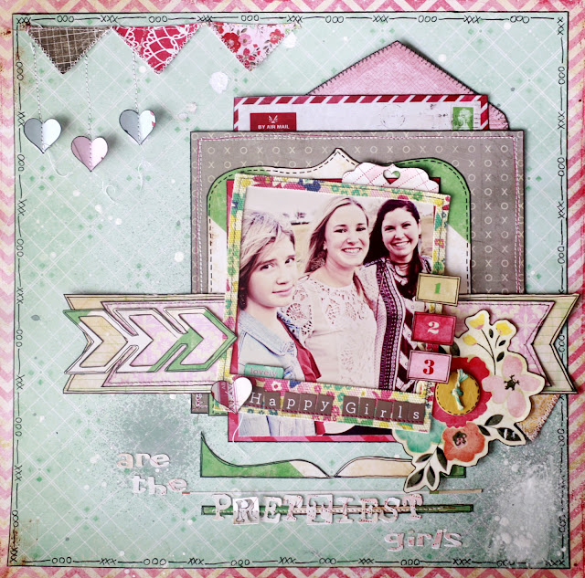
Happy Monday morning everyone! With Valentine's Day right around the corner, I have really been focused on the people and things I love - and scrapbooking all about them, of course! And some of my favorite papers to use have been from CRATE PAPER'S 14 COLLECTION, which is defintely on my TOP 5 Paper Collections List right now. The papers are saturated with color and a little bit vintage-y and absolutely perfect for layouts such as this one featuring my sweet, lovely daughters!
As my starting point, I used this fantastic sketch from CREATIVE SCRAPPERS. Seriously, Kristine's crew comes up with so many awesome sketches, I don't know when I will have time to get to them all!
Let me tell you a little bit about this layout - because I had so much fun making it!
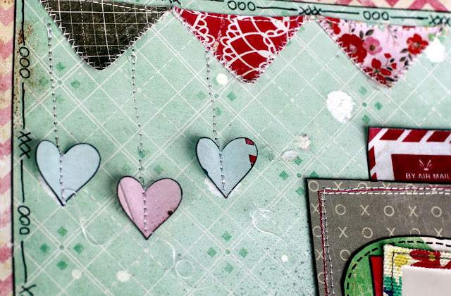
First, this banner was fussy cut directly from a page of - you guessed it - banners! I just cut a few out and zig zag stitched around my pieces, then sewed them across the top directly onto my layout. I initially had a second, different banner making a larger swoop below this one but decided it made my layout too busy - after I had already glued it down to my papers, of course! So, I ripped the second banner off, sewed these little hearts on top of a few of the ripped areas, and decided that the other visible tears in my papers were extra distressing that I MEANT to have on my layout - hahahahaha! Besides, they compliment my white paint spatters that really were put there on purpose. (Yes, I am the Queen of Rationalization - that's how I am able to continue buying new scrapbook papers when I will never use up all the ones I already have.) I left the threads at the end of my hearts long and uncut because I liked the way they looked.
I used one of the polaroid frames from a newer MAGGIE HOLMES' Collection (I LOVE her work!) Obviously, my picture is not square-shaped and not meant to fit in a polaroid frame. But I wanted to use it so I just angled it across the top as an accent. The number blocks were originally part of a border strip on one of the 14 Collection papers that I simply cut up, outlined, and pop-dotted on my frame.
Here is another view of the center of my layout and one of the reasons why I chose the Creative Scrappers sketch that I used - LAYERS!!!!!! I love the layers! And look how scrumptious these papers look together - almost good enough to eat! Okay, not really, but these papers ARE perfect for layering...and for sewing on!
My title, "Happy Girls are the Prettiest Girls" is part of a fabulous quote by Audrey Hepburn. It's overused now, but I still love it anyway! And, like my papers, it was perfect for this layout. I used my Silhouette Cameo to cut out those small letters. I also cut out a few of the negative outlines left over and used those in place of the letters.

And speaking of my Silhouette, I love using it and my small scraps of leftover paper to make little extra things like this tab that I added to my layout. "Waste not, want not," as my Grandmama used to say. And what a super cute way to make sure my paper isn't wasted!
Last, but not least, is the bottom of my layout. I didn't have quite enough of the green and white striped paper I wanted to use and I didn't like my picture just hanging off the bottom of my layered papers, so I took some of the thin cut-out strips and placed those under my picture to give the "suggestion" of a continued background paper.
That's it for me today. Hope you are staying dry and warm whereever you are!


you never cease to amaze me....gorgeous, gorgeous work!
ReplyDelete